The PJL
Rewiring the voice of showjumping.
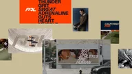
Showjumping has always traded in prestige. The Premier Jumping League (the PJL) set out to evolve that, not by rejecting its heritage, but by unlocking what’s always been there: intensity, power, and the split-second dialogue between horse and rider. Typography became the lever.
Credits
- Chris Nott
- William Richardson
- Diego Aravena
- Frankie Guzi
- Franco Jonas
- Matt Burvill
- Marion Bisserier
- Connie Wemyss
- Will Rayner
Client
- The PJL
- NOT Wieden + Kennedy
Services
- Custom Typefaces
- Logo Refinement
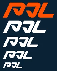
The PJL Mark
It starts with the PJL logo, which was refined in harmony with the type system. Angles aligned, proportions refined, and details sharpened ensuring the mark doesn’t sit apart, but anchors the entire typographic language.

The PJL Typeface Family
The challenge: create a type system that holds two opposing forces in tension: luxury, precision, heritage and speed, impact, physicality.
It needed to perform everywhere from broadcast, leaderboards, environments to digital and feel unmistakably PJL at every scale. Not just a typeface, but a system capable of carrying the sport forward.

The idea: A custom type family shaped by the mechanics of jumping itself, the compression before takeoff, the arc in flight, the release on landing drawing from the energy and motion of the horse. Where traditional expression feels static, PJL moves.

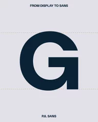
The solution: A dual-type system built for contrast, clarity, and distinctiveness. A high-impact display face paired with a functional sans


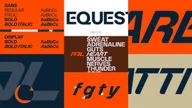
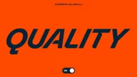
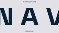
PJL Display
Expressive and unapologetic. Built for headlines, moments, and identity.
A dynamic italic angle captures the trajectory of a jump, whilst curved transitions reflect the rhythm of the course. Sharpened rounded terminals in select cross strokes echo horses' hooves.


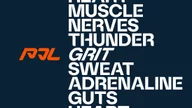

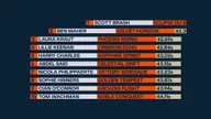
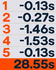
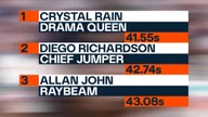
Numbers lead the story, timings, rankings, margins. A bold, graphic numeral system elevates performance data into brand-defining moments, optimised for clarity at speed, distance, and scale, with optional stencil forms that add more dynamism.

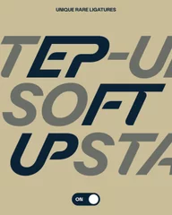
Custom ligatures, including unique rare ligatures, subtly reference the relationship between horse and rider and create more dynamic and harmonious letter pairings suited for graphic headline settings.


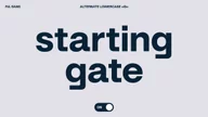
PJL Sans
The workhorse of the system. Clean, legible, and engineered for broadcast clarity and data-heavy environments from timings to rankings while sharing the same DNA as PJL Display.


Together, the family flexes between theatre and utility without losing coherence.
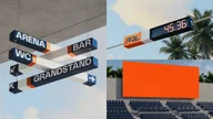
Integrated with The PJL’s wider visual language, the Rail system is embedded directly into the letterforms, creating a clear connection across the identity.
Typography becomes structural locking into layouts, reinforcing rhythm, and carrying consistency across every touchpoint.

The result: A type system that transforms how equestrian sport shows up.
It retains the polish the world expects, while injecting the energy it’s been missing. From high-fashion hospitality to high-speed broadcast, the PJL now speaks with one voice. Distinct, ownable, and built to scale.
