Warburtons
A bespoke typeface family for Warburtons, blending warmth, character, and British typographic DNA into a flexible system designed to perform across every brand touchpoint.
Credits
- Chris Nott
- Connie Wemyss
- Diego Aravena
- Franco Jonas
- Frankie Guzi
- Matt Burvill
- Will Rayner
- William Richardson
Client
- Warburtons
- Taxi Studio
Services
- Custom Typefaces
- Logo Refinement
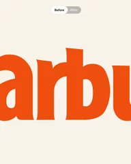
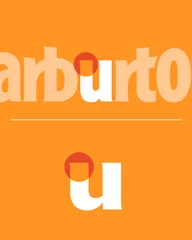
Evolving an Icon


The Warburtons wordmark has been thoughtfully refined to strengthen its role at the heart of the brand. By carefully tuning proportions, spacing, and key details, we’ve enhanced its warmth, confidence, and recognisability while ensuring it works seamlessly within the refreshed identity and crafted roundel. The result is a more cohesive mark that feels true to Warburtons, now and into the future.

The Voice of Warburtons

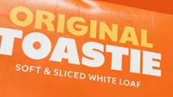
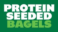
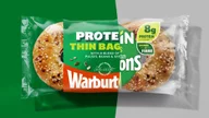
At the heart of the refreshed identity is a bespoke typeface family designed to bring the Warburtons brand to life in words. Built with warmth, character, and flexibility in mind, it balances soft, doughy forms with confident, clear structure. Rooted in British typographic DNA and shaped by the brand’s unique voice, the family is crafted to perform across every touchpoint, from bold product moments to everyday communication.

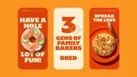


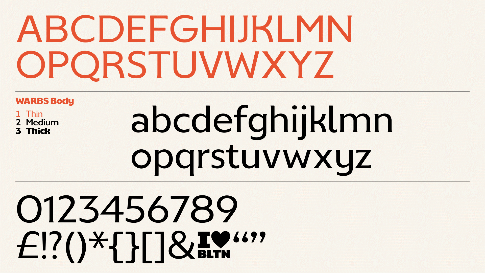

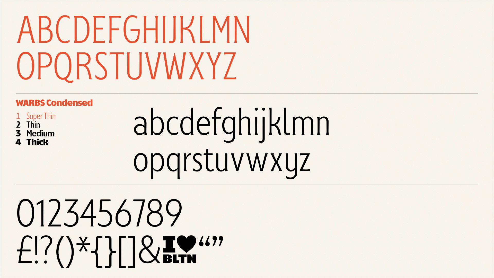
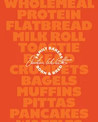
The Warbs family has been developed with three distinct cuts to suit different needs across the brand. A condensed cut for back-of-pack scenarios where space is limited, a body cut optimised for clear, accessible reading in text-heavy applications, and a headline cut crafted for impact and standout moments.
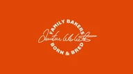
To further embed the system within the brand, each weight is named after familiar Warburtons bread slice, creating a typographic family that feels both purposeful and unmistakably connected to the product range.

Finding the Perfect Recipe


Creating the Warburtons typeface was about striking the right balance between brand and typography. We brought together the key ingredients of Warburtons’ personality, its warmth, pride, and optimism, with carefully selected typographic characteristics drawn from British Humanist and Grotesque traditions.
By blending these elements, we’ve crafted a typeface that feels authentic, characterful, and consistent, a true expression of Warburtons baked into every letter.


Baked-In Intelligence

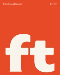
Beyond the core letterforms, the typeface is equipped with a suite of OpenType features designed to add flexibility and control. From unicase alternates and stylistic sets to refined numeral options and contextual behaviours, these features allow the typography to adapt seamlessly across different uses. Whether dialling up personality for standout moments or ensuring clarity in more functional settings, these tools are thoughtfully crafted to help the typeface work harder across the entire Warburtons brand landscape.


A Hidden Slice of Home
As a subtle nod to Warburtons’ roots, we’ve embedded a hidden I ♥ BLTN Easter egg within the typeface, inspired by the iconic coffee mug that’s appeared time and time again across their advertising. Spotted by our directors Frankie and Chris during a deep dive into the brand, it felt only right to celebrate this quietly consistent detail. It’s a small but meaningful homage to Bolton, adding an extra layer of character and authenticity baked into the typography.

