Yoto
Creating a playful, accessible and characterful type family for a new generation of screen-free entertainment
Credits
- Chris Nott
- Connie Wemyss
- Diego Aravena
- Franco Jonas
- Frankie Guzi
- Matt Burvill
- Will Rayner
- Will Richardson
Client
- Yoto
- Wild People
Service
- Custom Typefaces

Founded in 2017, Yoto is an interactive audio platform designed for screen-free listening that puts kids in control. Their award-winning audio players enable children to discover world-class audio content, with a library of over 1,300 Yoto Cards available which are played by slotting them into the top of the players.
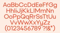
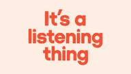
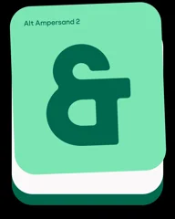
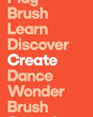
Working with Wild People and Yoto, we designed a new child-first type family for the brand crafted around accessibility and friendliness. Supporting an inventive and playful new brand toolkit, it consists of a Headline cut and a Text cut, each with 4 weights and corresponding italics. Across all variants, we worked hard to maintain a consistently familiar ‘Yoto-ness,’ ensuring the brand's distinctive and whimsical brand voice is clear at all point sizes and across all touchpoints.
Yoto Headline

Yoto Headline was drawn with accessibility and flexibility in mind. Built from a playful geometric foundation, it features subtle nods to the product design of the Yoto players and the Yoto Cards which activate the devices.
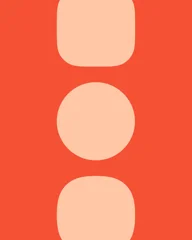


The curvature of letterforms like the «f» and «t» reference the shape of the Yoto Mini 4th Gen player, whilst round geometric forms in the uppercase «C», «G», and lowercase «e» draw influence from the kid-friendly buttons and dials. Most noticeably, the dot on the lowercase «i» are derived from a birds-eye view of the larger Yoto Player 4th Gen.


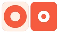
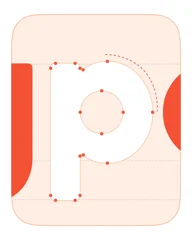
We then built on this playful geometric foundation by softening the corners of letterforms, including their counters - giving the typeface a softer, friendlier appearance. This carries throughout the weight from Light to Bold, and into corresponding ‘oblique’-style italics, giving the typeface an enhanced versatility in headline, subhead, and even body settings.





Yoto Text

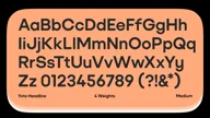
Next, we translated the friendly foundations of the headline cut into a highly legible text variant, ideal for body, paragraph and caption uses. We adjusted the weighting to ensure readability at the smallest point sizes, harmonising with Yoto Headline. Terminals on letterforms like the lowercase «e», and «s» were opened up into diagonal terminals, and individual characters were swapped out for highly legible alternates for better clarity.

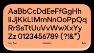

The schoolbook-style single-storey «a» was swapped out for a more legible double-storey version, whilst the lowercase «y» was opened up into a simpler angled design. We sharpened the corners to ensure crisp, clear reading, whilst still keeping an intrinsically ‘Yoto’ feeling in the Text cut.

Unmistakably Yoto

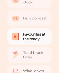
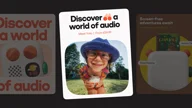
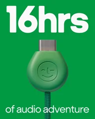
Working harmoniously together, Yoto Headline and Text form an integral part of the brand’s refreshed toolkit. Alongside a suite of playful motion and graphic devices, the Yoto family works hard across a number of different touchpoints. From OOH to packaging to online content, always unmistakably Yoto in a way that appeals to parents and their children alike.

Type Tester
