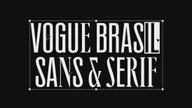
Vogue Brasil Typeface
A dual-style typeface system that balances editorial elegance with Brazilian vernacular. Culturally grounded and expressively styled for use across every touchpoint.
Credits
- Chris Nott
- William Richardson
- Tom Baber
- James Griffin
Client
- Vogue Brasil
Services
- Custom Typefaces
- Animation
Recognition
- D&AD Graphite Pencil
- Tokyo Type Directors Club
- Brand Impact Awards
- Fast Company's Award
Authentically Brasilian.
To coincide with a redesign of the magazine, Studio DRAMA was commissioned by Vogue Brasil to craft a display typeface to be used across all Vogue Brasil brand touch-points, from print through to pixel.


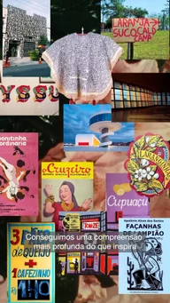
The Vogue Brasil team presented Studio DRAMA with a comprehensive research document, which was rich in culturally authentic typographic source material. Spanning various mediums such as art, graphic design, literature, architecture, film, and music.

Elegance meets Vernacular.
After an extensive period of review, Studio DRAMA settled on two axis; one being, vernacular, not only an exciting emerging movement in Brasil but an idea that felt uniquely Brasilian, which was a very important factor when crafting Vogue Brasil’s typeface. This allowed letterforms to be influenced by hand-drawn techniques and quirks as well as unconventional typeface design standards.


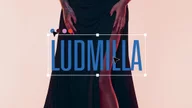
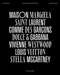
The second; elegance. Vogue Brasil is an iconic and elegant brand, with a rich heritage in lifestyle, beauty, and fashion. So it was important that this was communicated in the final result. Letterforms that felt effortlessly stylish, and graceful but also unique and impactful, inspired by references found in iconic Brasilian publications, such as Klaxon and Arlequim Magazine, as well as Vogue’s rich and evolutionary masthead and cover designs.


Harmonious Contrast.


A common approach to creating articulation within a typeface family is through weight, for example light/bold, medium/black etc. However, through the lens of elegance, Studio DRAMA crafted 2 distinct typographic styles, Vogue Brasil Sans and Vogue Brasil Serif.


Playfully ‘fit-for-purpose’
Designed with versatility in mind, both Vogue Brasil Sans and Serif support a wide range of typographic circumstances and playful ‘fit-for-purpose’ moments. With stylistic sets informed by Studio DRAMA's comprehensive analysis of Brasil's typographic landscape, both styles are equipped to give the Vogue Brasil team more creative flexibility when using the typeface family.
To allow the Vogue Brasil team to create tightly spaced headlines, pull quotes, and other large set copy, without clashing between lines, each style has a set of ‘cap-height diacritics’, this is where diacritics fit snuggly into same space as a regular capital letter rather than sitting above or below them.

Type Tester

