Heinz Typeface
A bespoke typeface family born from one of the world’s most recognisable wordmarks—preserving Heinz’s bold personality while enhancing clarity, consistency and global reach.
Credits
- Chris Nott
- William Richardson
- Diego Aravena
- Florian Runge
- David Suid
- Oliver Dell
Client
- Kraft Heinz
- Jones Knowles Ritchie
Services
- Custom Typefaces
- Animation
Recognition
- D&AD Wood Pencil
Preserving and Evolving

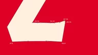
Heinz’s iconic capital letters were redrawn to bring consistency, rhythm and clarity to a set that had become disjointed over time. Every curve, angle and terminal was crafted with care—preserving the bold personality the world knows while refining the details to meet today’s typographic standards. It’s a quiet evolution, but one that makes all the difference.


Globally Recognised, Endlessly Iconic

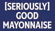
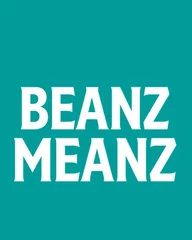
From Beanz and Ketchup to Mayo and Cream of Tomato, Heinz is instantly recognisable on shelves across the world. Typography sits at the heart of that recognition. By aligning the type with the brand’s most distinctive visual cues—like the keystone, wordmark and label shape—we helped bring cohesion to a brand world that spans over 200 countries and countless iconic products.


Unmistakably Heinz
Heinz’s iconic capital letters were refined to enhance consistency and craft, ensuring every detail felt intentional and true to Heinz’s heritage.


Every letter in the Heinz type family was crafted to feel like Heinz—even in isolation. The familiar rhythm of the wordmark became a guiding principle, while the keystone informed the angles, curves and cuts throughout. Built in harmony with the full brand toolkit, the result is a typographic voice that feels as ownable as the brand’s taste.
NEW! Label

We expanded the original headline typeface with a completely new lowercase, numerals and punctuation—giving the brand more control and tonal range than ever before. For the first time in 150 years, Heinz can speak softly or shout proudly using the same iconic typographic voice.


A Rich Reduction

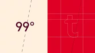
Heinz Sans is an all-new addition to the Heinz identity, offering a fresh, modern voice that, using the same unmistakable Heinz DNA, complements the iconic Label style while expanding Heinz’s flexibility across packaging, campaigns, and digital platforms. Designed bespoke for extreme legibility at small sizes, including legal information and back of pack.


From Bottle to Browser
The Heinz type family was built to perform everywhere—from a ketchup label in a fridge door to a campaign on the side of a bus to an ecommerce carousel in Singapore. It’s not just about consistency, but clarity, flexibility and confidence—wherever Heinz shows up.


Typesetter

