BODYARMOR
A custom wordmark and typeface forged like armor, BODYARMOR Display has been crafted to interlock with confidence and control. Each letterform strengthens the brand’s athlete-first attitude, giving the Coca-Cola owned business, a voice that cuts through with clarity and unmistakable presence.
Credits
- Chris Nott
- Will Richardson
- Diego Aravena
- Franco Jonas
- David Suid
- Matt Burvill
- Frankie Guzi
- Will Rayner
- Connie Weymss
Client
- BODYARMOR
- Coca Cola
- JKR New York
Services
- Custom Typefaces
- Logo Design
Armor in Typographic Form
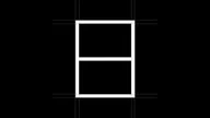
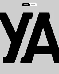
Our refinement of the BODYARMOR wordmark focused on bringing more precision, impact and details. It features sharper slab serifs with a more intentional ‘semi-slab’ approach improving legibility of the mark at smaller sizes. Other refined elements such as the raised vertex on the «M» and improved spacing between the «A» and «R» helped to improve clarity of the mark and give it a stronger presence.


Type that stands its ground.
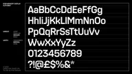
BODYARMOR Display takes its cues directly from the brands shield and coat of armour — a visual language built around protection and strength. Based on a strong geometric foundation, its letterforms are structured to feel solid and purposeful, with details that reinforce precision and resilience — such as logo-inspired angular features which embody the athleticism and performance which is core to BODYARMOR’s brand.

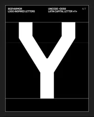

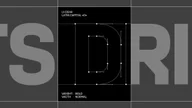
BODYARMOR Display comes in three widths—Condensed, Normal, and Wide — each with four weights from Light to Bold. Built like a modular system of armour, it's a robust typographic system that can adapt to different contexts.


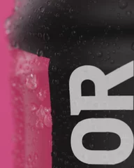
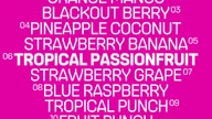
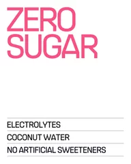
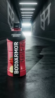
The typeface performs reliably across packaging, digital, and print. Delivering a clear, stable voice through every part of the BODYARMOR brand world.

Tested across terrains




Type Tester
